


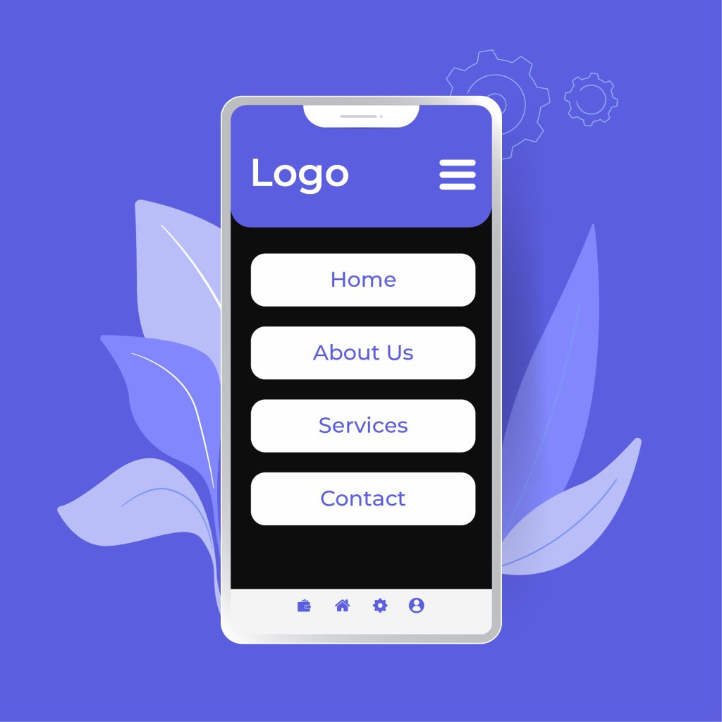
As people start gravitating towards mobile phones over desktop devices as their primary source of news, information, entertainment, and other content, the need for designing mobile-oriented content continues to grow.
That is not to say that people will stop using their laptops anytime soon, or that websites geared to users are not accessible through phones. But the fact is that mobile content is a challenging arena for web design and needs more attention.
Of course, there are a lot of technical concepts that go into enhancing mobile content. For now, however, we’ll focus on a few general yet extremely important areas by discussing 4 tips for creating content for mobile users that guarantee the best results.
1- Embrace Brevity
Because mobile phones offer a lot less space, it’s important not to cram the screen with stuff that only occupies that space and does nothing else. That technique might work well with the more generous resolution of your computer screen, your approach needs to be more efficient.
In fact, this doesn’t just apply to mobile-friendly content, but to virtually all forms of web-based marketing and digital communication.
People’s attention spans, like their time, are limited. Instead of long-winded stories, your written content needs to be straightforward and to the point, which is usually the case for short content. So instead of going with too much length, try summarizing your point as succinctly as possible.
Limit Your Headings
For topic titles and openers, it is generally recommended to stick to about five or six words and remain below 60 characters. This achieves two things.
- It ensures that your readers don’t feel like their time is being wasted before they’ve even gotten to the real content.
- Elongated titles are often cut off and users have to struggle to understand what they’re reading. This prevents that.
But more to the point, fewer words per heading means that you have to choose them carefully. This encourages creators to opt for catchier yet informative headlines that leave readers curious for more.
Get Rid of The Waste
Once again, this practice doesn’t just benefit mobile content; that is what we’ll be focusing on. The restricted screen space that phone users have to deal with means that paragraphs that are readable on their notebook or tablet are much more compressed and crowded. This can be discouraging to busy readers.
So, when drafting your text, read it again and again and find out how much of it you actually need and how much of it needs to go. And going back to the issue of keeping things to the point, avoid long phrases or clichés and use shorter words and sentences instead as they can be just as impactful and often more so.
2- Grab Attention
A key difference between desktop and phone users is that, when people use their laptops, they are much more dedicated and attentive to their activities and what they’re browsing.
Phone users are either in much more of a hurry or they are multitasking with the phone in one hand. Since they are trying to save time, it is clear that they don’t have much of it (or at least they don’t think they do).
Therefore, when designing content for mobile phones, it needs to be presented in a way that actually moves the reader to remain engaged to devote their undivided attention to what you’re trying to say.
Style and Substance
For mobile sites, it is important to offer your most meaningful content in a way that people are able to appreciate it better. This includes stylish designs, nifty features like buttons or collapsible lists, bullet points, and a handsome yet readable background against a chic background that is easy on the eyes.
As you’ve probably guessed, this won’t be easy. But once you’ve achieved this, gaining traffic and improving your audience scores will be a cakewalk.
Eye-Catching Visuals
You can argue that designing mobile-friendly content is like preparing a PowerPoint presentation. Instead of filling the screen with an ocean of text (as we mentioned above), you can enlighten users just as effectively through brilliant images and catchy, vibrant color combinations.
Visual media in particular provide a great way to tell a story without boring your target users. Therefore, it’s important to arrange images and videos properly to do so, which we’ll get to in a minute.
Highlight Your Message
A call to action or defining slogan is what websites and online businesses use to really get their message across to users.
But on mobile sites, as we keep reminding ourselves, the screen space and user’s attention spans are not on your side. So, make sure to highlight your primary objective and calls to action front and center. The longer others must struggle to find it, the more likely they’ll just go elsewhere.
3- Optimize Your Content
One of the main reasons why mobile versions of websites and media fail to get the traction that they deserve is the narrow-minded design features. Though people don’t even desktop for many apps anymore, it still forms the basis of design schemes for many sites and servers.
While many desktop-friendly sites and applications can still be used on your iPhone or Android phone, the fact that they are developed for laptops and computers makes them a bit tricky for phone users to navigate quite as well.
Content needs to be managed in a way that either prioritizes mobile features or at least treats them with the same attention to detail.
Redefine Responsiveness
Traditionally, “responsive” content for phones means that your webpages are modified to fit with your device’s capabilities, like screen space. While this concept is often thrown around, its scope is fairly narrow and often steals the limelight from other issues that need attention.
Instead, responsiveness should underline the features that make content mobile-appropriate, like loading time and media configuration.
Media Files
As we discussed earlier, visual media files are an important tool in making your mobile-friendly content worthy of attention and allow it to keep users focused and engaged. Therefore, it is absolutely crucial that your images and videos are just as accessible, if not more, here as they are on desktop versions.
Images
For images, the choice of format is not a major issue as both PNG and JPG files are popular across the web. In the case of GIF files, moving pictures can take time to load on phone screens so either avoid them or make sure that your images load quickly and are presented well.
Only use image files that are relevant and improve customer experience, and ensure that they are strategically placed to grab attention but also inform or direct the user’s concentration to the relevant material. This can be achieved through file compression or smart graphic editing.
Videos
For embedded videos sourced from platforms like YouTube, ensure that their features are compatible with phone use. For original or proprietary media, encrypted streaming or appropriate software should be used to host the files for it to play properly.
But aside from the technical aspects, subtitles and closed captioning with suitably readable text are also important in gaining viewers through your videos, so work on that too.
4- Always Test Before Release
This is perhaps the most important step in creating phone-friendly content that is often underestimated but one that you should not ignore in any circumstance.
Before making your website, application, or software available to the public, make sure to perform a demo or preview on standard mobile devices to see how the final product is working.
There are two reasons for this: firstly, publishing unfinished content or a website full of mistakes or faults doesn’t just stop people from using it, but damages your reputation as a creator. Secondly, a double-check allows you to add further, much-needed finishing touches that you might have forgotten or simply not thought of at first.
Closing Statement
Designing iPhone or Android-friendly content is about creating more when you’re given much less (in terms of screen space and people’s attention). But with these 4 helpful tips for creating and optimizing content for mobile users, your goals will be clearer and easier to achieve.


