Table of Content
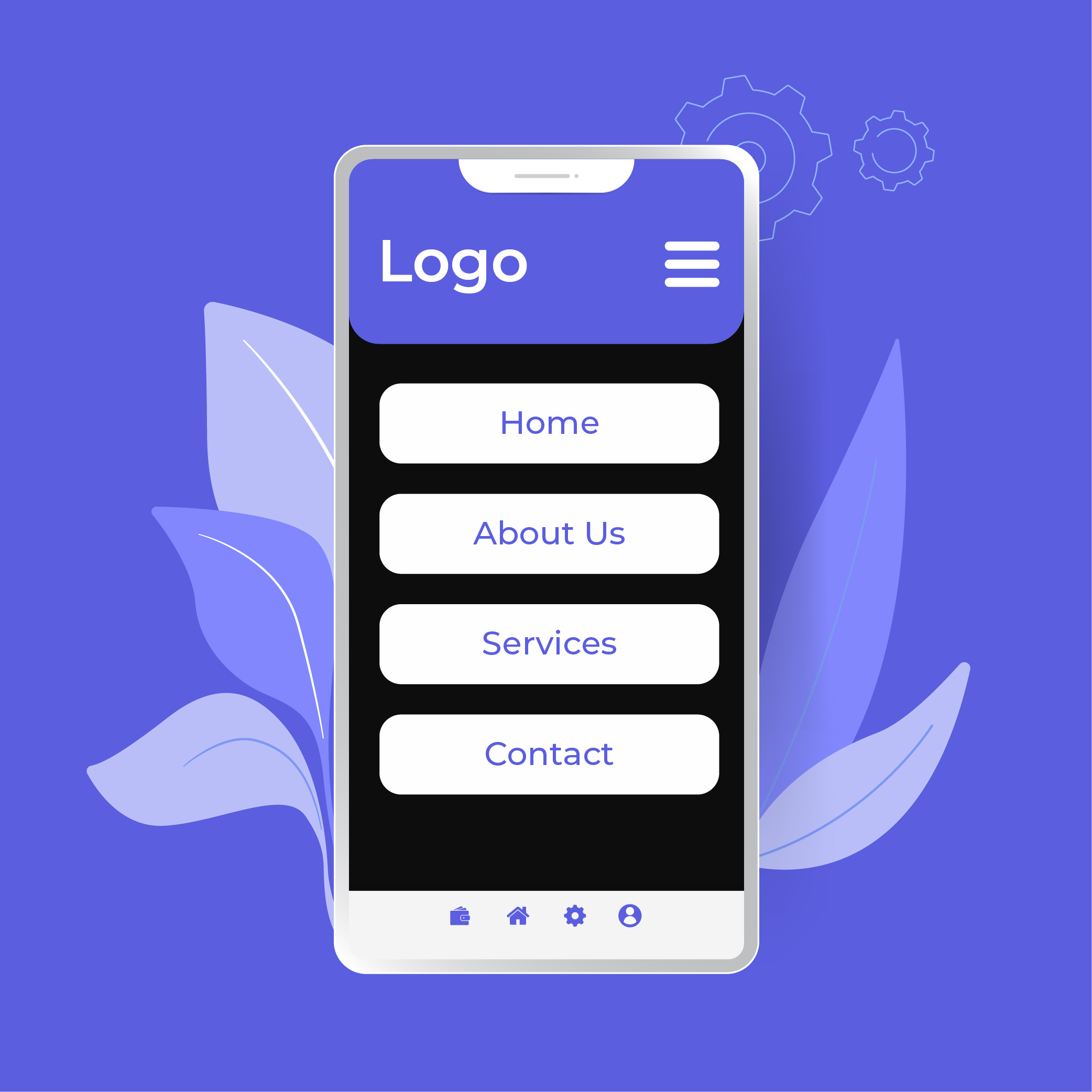
An organized list of links that contain the information about the web pages of the site is known as a navigation menu. In this article, we will teach you 8 ways to add a responsive navigation menu to your site along with many details of the navigation. This menu contains many links that are internal to the website. Which helps people gain access to the portion where they want to go.
It can also have information that is outside of the webpage containing the website rivals to differentiate the services provided by both companies. An experienced company is an expert in performing work that has greatly benefited the clients. No doubt, a reputed company contains experts and professionals that can make your job simple as they can perform many tasks in a simple and efficient way.
Navigation is an important project for the website. During website designing, it is used to make sure that the website will gain more traffic reducing the bounce rate. This helps in keeping the user on your website and exploring other services offered on the website. When creating the website there are many things that need to be considered. Color, size, orientation, etc.
Links Organization
The most important point in website design is to keep the navigation menu clean. There are dozens of links within a website. Keeping them in order helps clients safely navigate the website. The header topics like products, services, information, etc. These headings contain links to the sub-variety of the information related to them.
The most used practice is that important topics go from left to right. While others are distributed within the webpage with brief information related to the topics. Topics must be thoroughly organized to present where they fit the most. Links must be arranged in a way that they are easy to find.
The current technique of website design has started to change. People are using two different headings to explain the services of the company. The first heading contains information about the company, its services, portfolio, resources, and many more. The second heading is used to present information about the product and its categories that are on sale.
Those who want to design a website, they must make sure the content and design they perform are highly compatible with any device. Take Facebook as an example having a top header containing the information related to the id owner. While the list on the left represents many different subjects like groups.
When scrolling down the page on Facebook you will notice the top heading remains where you can easily be accessed. The heading on the left remains on the very location at the top of the page. Access to it becomes difficult and the user has to go to the top to gain access to the said headings.
Design the Navigation Menu
Clear Description
No matter where you are placing the menu bar it must be prominent and clear. Throughout the website, it must be easily accessible making it easy for prospective clients to access the different parts of the website. A change of color or tone can make it easy for people to recognize and may even increase the reputation of the company because of the display of multiple colors.
Positioning
For any website, the positioning of the navigation is very important. The first-place people look for such things is the top of the page or left side. These are the most prominent location for any navigation to exist. After certain people will not try to access much of the navigation because most websites have prominent data displayed on the top of the left side.
Consistent
A homepage is not the only place where the links should be used. The links provide the site users the opportunity to direct their attention to other products that are responsible for the popularity of the company. As for the original links of the website and products they must remain consistent on any page. The perfect location is the top or the left side.
When the main links of the website are consistent this will become a client to smoothly navigate the website. If the links are not consistent people will have to visit the homepage repeatedly just to gain access to other links on the site.
The Simplicity of the Menus
The job of the menu is to guide people to the designated area where they wish to visit. For such things to happen the links in the menu and the names must be clarified. A link must only access the said location because it can decrease the overall reputation of the company. Bad links have the effect of opening false files or giving errors. This must be prevented.
Many times, people will get confused because of the presence of synonyms in the link. To gain full advantage of the navigation system such mistakes must be avoided at all costs.
Drop Down Menus
This option is used when the links used for the website are greater than what the bar can handle. Make sure the pages are in proper order and have proper tabs so finding them will be easy. Drop down menu is used in many scenarios which can result in a proper outlook for the website.
The use of pictures in the drop-down menu is not recommended. For any website especially responsive ones the drop-down menu is extremely because it can not only save space but will also be thoroughly organized.
Heading on the Menus
For side menus, the feasible option is to create a proper heading. Placing proper identification for the subcategories help people to easily navigate through the website fast and smoothly.
Scrolling and Menus
As stated above the top heading menu should remain active at all times even if the scrolling is being performed. Having a good menu will result in gaining positive points. If the menu has irrelevant information and is not designed properly it can become a cause of irritation for people.
Preferred options
There are many methods to implement a responsive navigation menu on the website. People can create their own menu because the information related to such topics is available online. If you want the work done then you can also refer to open-source code. Following are the 8 ways to add a responsive navigation menu to your site.
Bootstrap Nav and Navbar
In Bootstrap, there are two components for the building of response navigation. They are known as Navs and Navbar. If a person simply needs the navigation menu, he should customize the build of the bootstrap. Simple customization to only include Navs and Navbar-related files should do the work.
Menu Aim
This uses the jQuery plugin for drop-down menu options. The query completely understands whether the person is hovering or navigating the drop-down menu. When moving in a specific direction the cursor reads the content of the next menu and displays it the moment the cursor appears on top of it.
The programming of the plugin allows it to collect the information of the next menu without any trouble. It is one of the responsive menus that does not give any delay when working. The experience is similar to the ones used by amazon.com.
Responsive Nav
Responsive Nav is a light system that is only made up of 1Kb or less. It does not have any external dependencies on the responsive Nav after it is optimized. This means for it to work it does not require a JS library like jQuery.
Sidr
Sidr is also a jQuery plugin. It creates a new sub-menu in a vertical slide-out position. It uses CSS3 transition and can be used and accessed on desktops, laptops, and mobile phones. It also supports multiple source types.
FlexNav
This type of response navigation was created to tackle mobile phones since they have smaller screens than computers. The mobile nav is determined by the size of the mobile phone. Then the editing is done to help them give the user a simple and easier experience on the website.
TinyNav.js
It is a small jQuery plugin. It is used to convert <ul> and <ol> navigation for small screen to select a dropdown option. It also selects the current page automatically and selects the item. This type of Nav response has a new version stated above called Responsive Nav.
Pushy
Pushy allows you to build a responsive menu that is a mobile-friendly slide-out drawer. Although for old browsers like IE7 and IE9 it requires the support of Modernizr and jQuery.
SlickNav
SlickNav is a responsive navigation menu that has many options. It is suitable for sites and apps that have a large number of links and subcategories. It is highly considered because of the web accessibility since it is ARIA compliant.
Conclusion
For people who are looking to create a navigation menu the above-stated 8 ways to add a responsive navigation menu to your site will be greatly beneficial. Since most of these links are open source, they can help the company website in many ways.


